Wednesday, November 23, 2016 // The Statement
4B
Wednesday, November 23, 2016 // The Statement
5B
Everyone says it: Print is dead. Newspapers across the country
have been going through a process of intense change, as their
primary method of distribution moves from print to digital.
But my position as a managing design editor for The Michigan
Daily means that I lay out the front page for the print version of
a paper, design the layout of photos, the creation of graphics. I
create the look of the paper, the feel of it. Looking at myself and
my work for the Daily through I wondered how many before me
had toiled over that front page, and how few may follow. I was
conflicted. I don’t subscribe to the pure nostalgia some hold for
the screenless days, when books were the primary source of
information. While it’s easy to dramatize the transition from
print to digital using terms like death, I understood the very
real benefits. What I didn’t understand is how this transition
would change my relationship with the design of the paper.
Would seeing how many clicks I got on a page mean as much
as seeing a stranger holding up the newspaper I had designed
the night before? Is there a value shift when the paper ceases
to be an object? Can I still say I made something? If I couldn’t
control what was happening, maybe I could at least understand
it. Perhaps I could understand the ways that the paper has
changed over time as technology advanced. And I found some
answers in a library basement with a bearded man named Fritz.
***
One of the Daily’s copy editors had told me about the
man who runs the printing press for the Wolverine Press, a
letterpress shop operated by Fritz Swanson, a lecturer in the
English Department. Apparently he had been there so long that
when choosing his own uniqname and email he was able to pick
whatever three letters he wanted. The editor told me he had
showed her trays of old metal blocks of type, which they use
to make books, and showed her how to use them. That’s when
I realized I had no idea how the newspaper was actually made.
When I was finished designing at the end of each night I simply
sent over the InDesign file to the printer, and when I woke up
10,000 copies just magically appeared on stands throughout
the campus. I drafted an email to Fritz’s three-letter address
asking if he could take a few minutes of his time to explain
printing presses and how they have changed since the Daily
began printing in 1890.
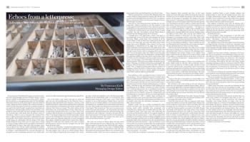
At 10 a.m. on a Thursday, I wandered through the basement
of the Duderstadt Library looking for Conference Room 100.
The only people I know who go to a North Campus library
are in the College of Engineering. Even though I am a senior,
the space is dark and unfamiliar to me. The fluorescent lights
flickered on the cement block walls. As I scanned the glass
enclosed rooms lining the central space, I saw a black metal
machine. It was an old letterpress. Smaller than I expected,
maybe the size of a kitchen island, it was meant for personal,
not industrial, use. I grabbed my pen and notebook and entered
the room. Three people were engrossed in conversation, which
I interrupted. They stared at me. There were two men and one
woman. Each man had a beard — one, old and silver, the other,
young and dark. Having heard the story about him being at the
University for such a long time, I turned to the man with the
silver beard and said, “I’m Francesca Kielb, from The Michigan
Daily.” He looked confused. The younger man stuck out his
hand and introduced himself. “I’m Fritz.”
***
The room was covered in shelves filled with tiny metal
blocks. Each shelving unit was a different font, each drawer a
different weight of a respective font (bold, bold italic, medium,
medium italic, etc.) These were the types of building blocks
used for all print materials created between 1450 and 1950.
This small room in the basement library was transformed into
a letterpress studio, which were once in common use, and the
three people in the room facilitated this travel back in time.
When I mentioned that I was from The Michigan Daily, the
woman, Rebecca Chung perked her head up. She said she was
an editor at The Michigan Daily from 1985 to 1987. According to
Rebecca, that period of time saw the greatest change in the way
that the paper was made.
“One year we were using typewriters and the next we were
using Macs,” Rebecca explained to me. Her presence in this
room suggested where her preference lay. I asked why, given the
grueling process, she preferred the years she used a typewriter.
“Typewriter method allowed you and forced you to think
concisely,” she said. “Everything I learned about editing I
learned from The Michigan Daily. We were brutal.”
I thought back to the night before, which I had spent at
my design desk, on one of the iMacs that populate the Daily’s
newsroom. Nights usually begin with a meeting of all the
section editors. I find out from News which stories they want
to put on the front page, and I talk with Photo about which
images they want to highlight. I then confirm if we have any
infographics or illustrations for the night, then oversee the
design and layout of all special inserts. The night always ends
with a call to the printers; after the articles have made their way
through rounds of senior editors, managing editors and Copy;
after I lay out the photos, place the articles on the front page
and organize the spill; after the infographics and illustrations
are exported as JPEGs so that they can be viewed online. After
all of that, once the call happens, only four people remain in the
room. I save the pages on one of the iMacs. The editor-in-chief
dials the number. “Did you get everything?” she speaks into the
phone. “The pages are all there? Great, have a great night!” She
hangs up. Then she announces to the few of us left, “We made a
paper!” Now, I imagined creating pages without our library of
templates, without the ability to drag and drop, without auto-
settings that ensure the text is always aligned and properly
sized. What would my night have looked like?
***
Fritz pulled up a chair and began his story. It started with
the letterpress. “You’ve worked in letterpress?” he asked. I gave
a nervous laugh and said “a little bit.” I have seen someone else
print a poster once but never actually done anything myself.
But in that moment it felt like a lie. Over email I made it clear I
wanted to learn, but then, sitting in that basement in a wrinkled
blouse, clutching my pen and notebook while holding up my
recording app on my iPhone, I wanted to be taken seriously.
“It’s a relief printing process. It’s a recombinant process,” he
continued without skipping a beat, “What Gutenberg did that
was special was he created a system for casting metal type
and being able to rearrange it. You’ve seen metal type before?
You’ve handled it?” “Yes,” I replied, again stretching my
single interaction with a press into some actual experience. I
nodded a lot. He told me that while letterpresses had been used
on smaller scales since the mid-1400s, newspapers were an
18th-century invention.
Imagine a room. You are a worker, surrounded by other
workers and their trays. You place letter by letter by hand,
forming words which eventually form paragraphs that
eventually form columns that eventually form one page. You
can smell the metal. And it gets worse. The whole page has
to be laid out backwards in order for it to appear properly on
the paper that gets pressed onto it — thus why it is called relief
printing. So you are letter by letter forming an illegible inverse
of the actual page, and if the tray is so much as slightly knocked
during the chaos of the creation process, the tiny metal letters
will fall and scatter onto the floor — and you will have to start
from scratch. I’m struck by the physicality of it, people making
something with their hands. To them, I imagine, what I do has
nothing to do with the making of a paper. To them, I imagine,
my work is so far removed that it might as well be displayed the
way it was created — on a screen.
Fritz divides the newspaper’s constraints at this time into
three categories: labor, materials and time, or how many
people can work in that space and for how long, how many sets
of metal type can be bought and stored at one time and how
quickly can the pages be assembled. The design of the front
page is merely “a consequence of those pressures,” he said. For
example, the size of a newspaper today stems from the size that
was convenient for one man to make in a mold in the 17th and
18th century. The sheet sizes were set by the manufacturer and
were essentially determined by ergonomics — the largest size
that was still manageable for a single worker to handle. Every
change, every cut or adjustment to this set size was another
added process, meaning added work and time. Making a paper
that filled an entire sheet, then, was the most efficient and
cost effective solution. As Fritz put it, it’s “the reason why a
newspaper is a newspaper, and not a news book. That is why
magazines didn’t come about until much later in the game. Thus
18th-century constraints have determined the sizing standards
for an era with infinite possibilities.” These conditions are why
my InDesign file that I drag and click and arrange each night is
the size and shape that it is. There is no other reason.
And it doesn’t end with the paper size. Why is text arranged
into narrow columns in newspapers rather than into a wider
setting like books? There is a reason for The Michigan Daily’s
ultra-condensed, four-column design on its original front
pages in 1890. On the tray where text was laid out there would
be set galleys, or channels built up on the press to divide the
words — metal lines of separation — making columns a norm in
newspaper printing.
At this point Rebecca steps in. “When I was working at the
Daily, I didn’t realize it,” she said. “But we had those cases, I
had to send copy down by 6 o’clock at night, and then we had
a typesetter named Lucius, Lucius Doyle, and he was grouchy
and mean and tough and we loved him. Once he was done doing
the hot metal setting, we would go look at it there and we would
look at a print and we would make final decisions. The more
metal involved, the fewer corrections he was willing to make.”
She paused, recalling the year before they transitioned to the
Mac.
“I had no idea that I cared about it so much while I was
there,” Rebecca said. “It was all just sinking in. But I’ll let you
two get back to talking.”
She returned to her work setting up the new letterpress
studio. Her self-realization prompted internal debate. Why do
I care that the digital file I create gets duplicated 10,000 times
on paper? Why does it matter that I can pick it up on my way to
class and hold it in my hands? Why is that more meaningful to
me that pulling it up on a screen? And lastly, will I care like she
cares when it dies?
“I’m glad she brought that up,” Fritz adds. “Because the Daily
was still set — do you know about the linotype machine at all?”
I lie, laugh awkwardly and say, “A little.”
I think he knows by now what my responses really mean,
because he explains it anyway. He explains that columns such
as ads would stay set up week to week to save labor. But in the
meantime the rest still had to be constructed by hand — that
is, until the linotype machine was made in the 1880s (though
not broadly used until the early 20th century.) Now, instead
of hand placing each letter, you could use a typewriter. Each
letter you pressed on the typewriter would prompt that same
letter in real life, in metal block form, to slide down into a line
on the newspaper tray. You could type a single line of text, then
that text would be cast in metal together into what was called a
slug. Now, say you trip and the tray spills on the floor. Instead of
having tons of individual letters scattered everywhere, you had
complete lines, formed together, which could be picked up and
rearranged again back to the proper order. This one machine
cut work time significantly.
This development explains why the column grid begins
to loosen up in the early 20th century. The linotype was able
to adjust the length of the lines (or slugs) that were cast, and
therefore headlines begin to span multiple columns and
graphics begin to enter into the designs because there was
no longer hand-setting of pages. The efficiency allowed for
flexibility. Yet it is important to note that, while minor changes
have been made, papers continue to stick with essentially the
same columns that were made 150 years prior.
Fritz paused. It had been more than 30 minutes and I
apologized for keeping him from the letterpress. He told me he
needed to get back to it soon, but wanted to finish the story. I
looked up and saw the other two time travelers in the room,
tinkering with the letterpress machine and organizing stacks
of hand-printed papers on a table.
He finished the story.
“It was probably a roller manufacturer in the 1950s who
observed this effect first,” Fritz said. “If you print onto a glossy
surface — like plastic — then if you press that glossy surface
back onto paper, it will deposit that ink.”
The capability to print with ink on plastic meant that presses
no longer had the restrictions of metal type, and paper could
instead be rolled through cylinders and printed. This technique
of drawing paper through cylinders meant that the paper could
be fed much more quickly, further improving the efficiency of
production.
Imagine you have been working a letterpress all of your
life. You are accustomed to the metal blocks of type, the trays.
You hold onto it for as long as you can, but eventually you just
can’t compete. Offset presses are taking over. They demand
less labor, they require simpler tools and they take less time.
It’s a no-brainer. Fritz told me The New York Times, despite
changing technology, printed on a letterpress until 1977. There
was a video shot by one of the linotype operators about the last
day of production on a letterpress.As I heard this, I sat there
and wondered, is that heroic, to be the last to stick to a dying
technology?
I was nervous to bring up the potential ecological benefit of
print’s death to a man setting up a letterpress, but I was curious
to hear his perspective and surprised by his response.
“We are in a position now where you should only print things
that you have to print — that must be in print … so how can we
make this more utilitarian, more functional, more useful?” he
said. “How can we leverage print so that we are not just echoing
the past mindlessly?”
I didn’t expect that from a man who has dedicated his life
to print. Fritz knew that the cost of printing was high — not
just financially. He was not of the mindset that business should
just continue as usual, quite the contrary. His was a mandate: to
understand the past and not press repeat, to ask questions and
to print that that must be in print.
But how do we determine what must be in print? Does our
small, local, student run newspaper make that cut and — if
so, why? Time passes, and the restrictions that originally
demanded every design decision no longer exist, yet the
conventions linger on, a remnant of technologies long buried.
Print design may just be a remnant of history based on prior
necessity, repeated blindly. Because, while I may have changed
fonts, increased graphics and enlarged photos, there are still
six, thin columns of text on our front page. Does that deserve
to be repeated 10,000 times a day? When I got up to leave, Fritz
went searching through the drawers and pulled out a small
piece of cardstock. On it was every letter and number from
his favorite font, Kennerley. He had set each letter of metal
type, one by one, on the letterpress and printed it by hand. He
reached out and gave it to me.
I held it in my hands. It was beautiful.
Echoes from a letterpress:
A design editor reflects on the history and nature of print
By Francesca Kielb
Managing Design Editor
PHOTO BY VIRGINIA LOZANO / Daily