EDITOR'S NOTEBOOK
Why We Doctored A Picture
To Make It More Real
The issue remains, howev-
e weren't trying to mis-
er. How would you know
lead you. But you may
which part of the picture was
think we were, so let's
"real" and which was an
talk about it.
illustration"? In what ways
Last week we ran a story about
was it changed?
William Beaumont Hospital, the facil-
This kind of
ity the Jewish community is
manipulation of
increasingly - using instead of
photographs has
Sinai Hospital. We ran some
become increasing
pictures of the Jewish chap-
common, and
lain there, but to introduce
worrisome, in the
last 15 years as
the piece, we ran a picture
advances in soft-
showing the sign at the main
ware
have made it
entrance, which is repro-
very
easy
to create
duced at the left above.
visual virtual reali-
The problem was that the
ties. But it's hardly
JONATHAN
original version of the pic-
a new phenome-
FRIENDLY
ture, above right, had this
non. The Stalinist
News Editor
big bright red "Do Not
government of
Enter/Wrong Way" sign
Russia used to
smack dab in the middle of
physically
cut disgraced for-
the image we thought would be most
mer
leaders
from the review-
helpful to you in envisioning what
ing-stand pictures for history
the hospital is. It was impossible to
books. I can remember
look at the picture without seeing the
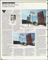
The orig inal photo of the Beaumont entrance.
watching a staff artist at a
sign and getting the message that you
Minneapolis newspaper
were somehow unwelcome at the hos-
home-furnishing photo - essentially
where I worked "white out" distract-
pital.
what we did last week with the
ing background details in a photo of a
I thought we might simply cut off
Wrong Way sign.
crime
scene.
the left part of the picture, leaving just
We defend the practice on a couple
About 15 years ago, the National
the big Entrance sign, but doing that
of counts.
cropping" would have cut out most
of the hospital building in the back-
'ground. And Alex Lumelsky, one of
our staffers in Creative Services, the
place where the stories and pictures
are combined to make the final page
that you see, said he had another idea.
Working for a few minutes with
standard software for manipulating
pictures, he was able to "erase" the red
sign and create, in the space where it
had been, something that looked a lot
like the parts of the hospital that the
sign had obscured. He worked from a
photograph taken from another angle
to be sure that the parts of the hospi-
tal he created were as true to life as he
could make them.
When I saw his work, I felt he had
done a fine job in creating an effective
and informative illustration, and our
The altered photo.
editor, Robert Sklar, agreed.
But we knew that your eye would
First, we think the picture we print-
Geographic magazine provoked a
have no way of telling that the original
ed reflects a substantial reality. The
major national ethics discussion when
photograph had been altered for dra-
Wrong Way sign was irrelevant and
it made a cover photo more effe'ctive
matic effect, so instead of the regular
distracting and the portion of the
by moving the background image of
photo credit along the top right-hand
image that we created to fill the hole
an Egyptian pyramid to better align
side of the picture, we put the words
was as close as we could make it to the
with the foreground image of a man
"Photo illustration by Krista Husa."
actuality of the building.
on a camel. The photo staff of the
Krista's our staff photographer.
We do the same thing, in effect,
Detroit Free Press conducted a very
with quotations, compressing and
vigorous debate and wrote some new
Jonathan Friendly can be reached at
rearranging the order of spoken words
248-354-6060, ext. 257, or by e-mail,
rules after an artist electronically air-
to heighten their readability. The
griendly@thejewishnews.corn
brushed a can of Coca Cola out of a
speaker says, "I think that if we can
Pho to i l lustrat ion by Krista Husa
"
3/19
1999
= Detroit Jewish News
train teachers properly and help them
access the proper sites on the Internet,
it can make synagogue learning a lot
more fun and a lot more interesting."
We may present that as: Synagogue
learning will be "a lot more fun and a
lot more interesting," he said, if we
train teachers adequately and "help
them access the proper sites on the
Internet."
Second, we label the presentation
differently, as a "photo illustration"
rather than a photograph. Admittedly,
the label is pretty small, seven-point
type tucked out of the way, but at
least it is there for the careful reader.
And finally, we make changes like
that as infrequently as we can. If
we've got time, we send the photogra-
pher out again, hoping the combina-
tion of lighting and traffic have
changed so she can get the building
from another angle. Or we use anoth-
er shot entirely, maybe of the hospital
lobby or some other place that will
quickly evoke for you the sense of the
place. (In this case, we had run out of
time before our Wednesday evening
deadline.)
You are entitled to believe the pho-
tos we run show what the photograph-
er saw. But sometimes the "real" gets
in the way of telling effectively what is
both true and important. So we make
a compromise as we did last week, and
we label it to alert you to look with
extra sharp eyes.
I hope you agree we are doing the
right thing.